Rounded corners are often lauded in the design world, UX / UI people claim rounded edges are easier on the eyes and makes information easier to process by our brains. A few years back it used to be a pain to achieve this effect though. With a developer having to use multiple rules in their style sheets to achieve compatibility over the major browsers. Luckily times have changed and a developer can easily round the corners of their designs with the use of the CSS3 border-radius property.
To use the border-radius property in its most simplest form, you simply need to add it to your elements definition and specify the length of the rounded edge in pixels e.g
#myElement {
margin: auto;
height: 200px;
width: 200px;
border: 1px solid #0000FF;
padding: 5px 5px 5px 5px;
border-radius: 10px;
}
The above use of the property will simply round all for corners of the elements with the id “myElement” to a length of 10 pixels.
See example.
What is meant by length?
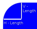
 Length is the distance used to define the vertical and horizontal radii of a quarter circle. In layman’s terms it defines the size of the curves on your element. A length can either be defined by actual dimensions i.e 10px or as a percentage corresponding to the dimensions of the element that is being defined.
Four values can be provided to the border-radius property to define different size curves for each corner other the element. These corner values are ordered from the top left in a clockwise direction e.g
border-radius: top-left top-right bottom-left bottom-right;
Differently angled curves
Each corner may also be styled separately with use of the four properties:
border-top-left-radius
border-top-right-radius
border-bottom-right-radius
border-bottom-left-radius
These properties can be provided with two different properties, defining the horizontal and vertical length of a curve. This allows flexibility with the angle of the curve applied to the chosen element.
Browser Support
The main question your probably asking yourself is can I start using it? Luckily the features is supported in all the modern popular browsers and has been for some time in most of them.
Opera 10.5+
Safari 5+ although rounded corners can be provided in Safari 3.1 – 4.0 by use of the -webkit-border-radius parameter.
Chrome 5+
Internet Explorer 9+
Firefox 1.0 onwards although the older versions require use of the slightly different -moz-border-radius property. With support for the standard border-radius property added with the release of Firefox 4.
Further Reading: